

Clarity: A Minimalist Website Template for AI Research
by Shikun Liu
n today’s AI research landscape, particularly with the rise of generative AI, it’s increasingly beneficial for AI researchers to include interactive blog posts alongside research publications. Additional media materials and online demos, popularised by Gradio Demos, can make research more accessible and engaging to a broader audience. While large corporations can easily leverage teams of graphic designers and writers to polish their design and writing, Ph.D. students and independent AI researchers often lack the time and resources to do so. Clarity bridges this gap by offering an aesthetically pleasing, easy-to-navigate template for presenting AI research, simplifying the process of creating visually appealing technical blog posts.

Introduction
Clarity merges designs I’ve developed over the years for my prior AI research projects. By open-sourcing this template, I hope to benefit the AI and broader science community, by providing a clean and hackable website solution to better present and visualise research.
In today’s AI research landscape, particularly with the rise of generative AI, it’s increasingly beneficial for AI researchers to include interactive blog posts alongside research publications. Additional media materials and online demos, popularised by Gradio Demos, can make research more accessible and engaging to a broader audience. While large corporations can easily leverage teams of graphic designers and writers to polish their design and writing, Ph.D. students and independent AI researchers often lack the time and resources to do so. Clarity bridges this gap by offering an aesthetically pleasing, easy-to-navigate template for presenting AI research, simplifying the process of creating visually appealing technical blog posts.
The inspiration for Clarity also comes from many AI pioneers who have written clear and interactive blog posts that have significantly helped me study new machine learning research and insights. I’d like to extend my deepest gratitude to David Ha, Chris Olah (as well as his great contribution to Distill Pub and Transformer Circuits), Lilian Weng, Ferenc Huszár, and Andrej Karpathy. Their work has demonstrated the power of clear, accessible communication in AI research, and Clarity aims to continue this tradition, fostering a community where knowledge can be shared easily, freely and beautifully.
Within this template, I will also introduce some design guidelines and tips, complemented by visual examples from my own projects and those I admire. These guidelines will help you create a polished and professional presentation for your research, ensuring your findings are communicated as effectively as possible.
Introduction
Most AI projects incorporate visual diagrams to effectively communicate complex concepts. These diagrams often highlight new neural architecture designs and ML training pipelines, which are central to the project’s contributions and research highlights. Clear and well-designed diagrams can significantly enhance the reader’s understanding and engagement with the research. In Clarity, texts and visual diagrams are wrapped within a div container to maintain consistent design layouts.
Introduction
Simple design modules, such as minor adjustments to a neural network block, can be directly embedded within the text in the same container, without additional captions. This approach helps readers comprehend the proposed concept in a seamless and integrated manner.
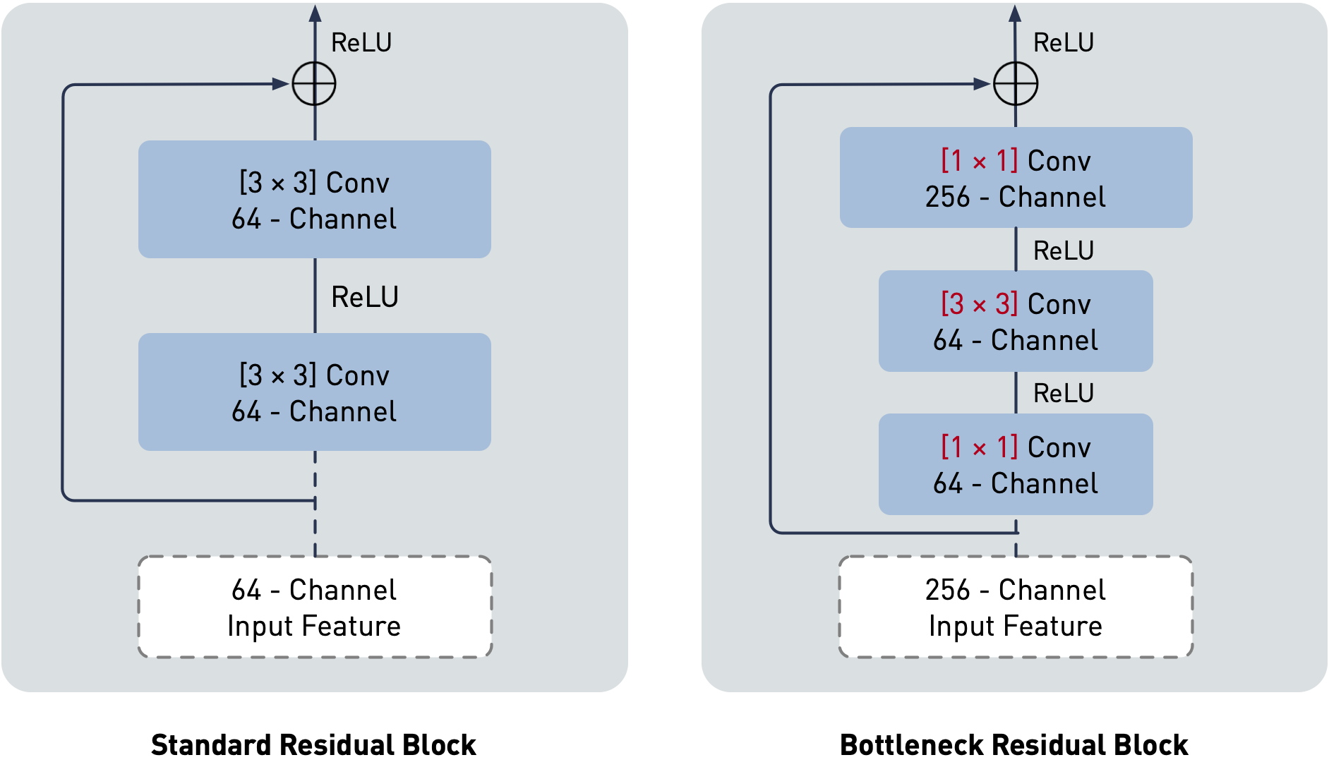
Here is an example I redesigned, illustrating the difference between standard and bottleneck residual blocks as proposed in Residual Networks.
For more complex visual diagrams, such as detailed neural architecture designs, it is recommended to use a separate container with a distinct background colour. This ensures that diagrams stand out and are easily distinguishable from the main text. Additionally, a new caption style is provided to help explain each design detail clearly.
Here is an example I redesigned, illustrating the difference between standard and bottleneck residual blocks as proposed in Residual Networks.
Here is an example I redesigned, illustrating the architectural details in Vision Transformers (ViTs).
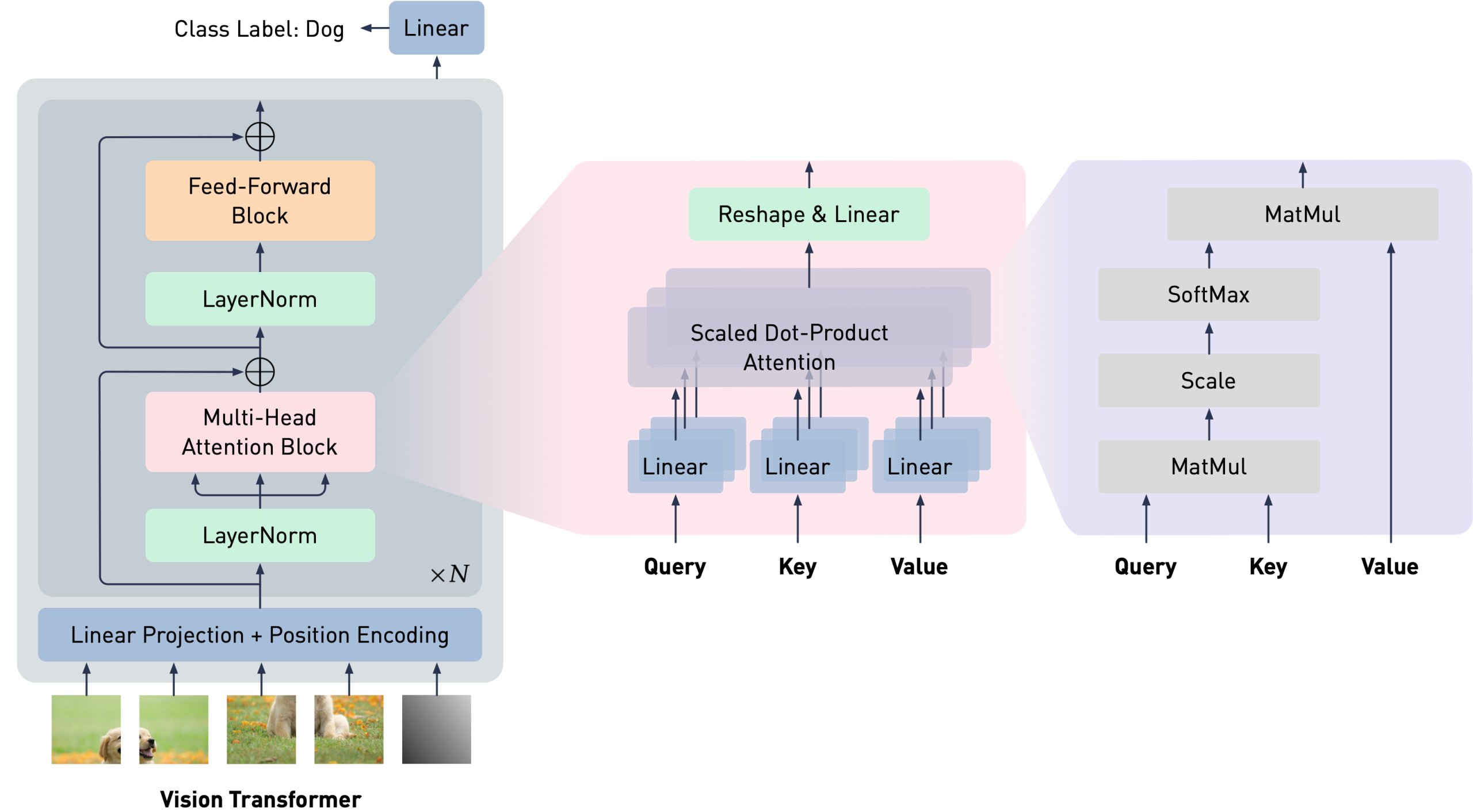
We split an image into fixed-size patches, linearly embed each of them, add position embeddings, and feed the resulting sequence of vectors to a standard Transformer encoder. In order to perform classification, we use the standard approach of adding an extra learnable “classification token” (represented as a gray image patch) to the sequence.
Container Layouts
In Clarity, I have provided container widths with five options: main, large, extra-large, extra-extra-large, and max. These container layouts are designed to be responsive, automatically adjusting based on the screen size. The default width is main, which is used for this blog post. Be cautious when using the max option, as it has zero padding. Unless you are certain of the design, it’s always recommended to leave some space for visual aesthetic purposes.
Here is an example I designed, illustrating the architectural details in Prismer using the extra-large container width.
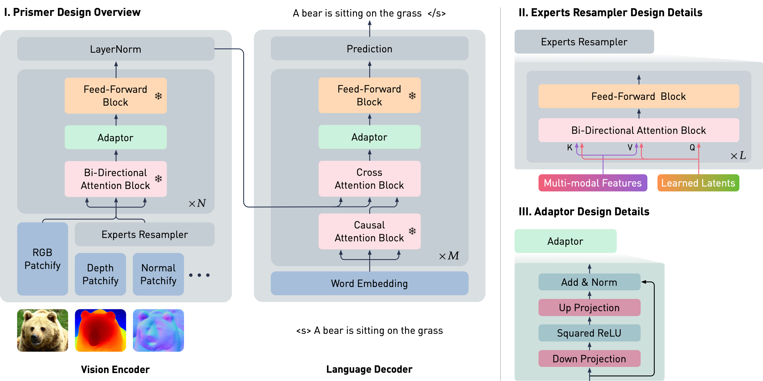
Prismer has two main trainable components: the Experts Resampler that converts variable multi-task signals to a fixed number of outputs, and the Adaptor that enhances the model’s expressivity for vision-language reasoning. To ensure that the model takes advantage of the rich domain-specific knowledge encoded in the pre-trained experts, the majority of network weights are frozen during training, as represented by the snowflake icon.
Container Colour
In both visual diagram examples above, I used the gray option for the container to apply a subtle tint of gray, helping to distinguish it from the main container. This option is ideal for visual diagrams with a transparent background. For visual diagrams with a white background, I included the gray-linear option. This feature adds a tint of gray only to the edges of the container while keeping the center white, maintaining a clean and cohesive appearance while still providing distinct visual separation.
Here is an example illustrated in VSL using the gray-linear container colour.
Container Colour
Container Colour
Container Colour
In both visual diagram examples above, I used the gray option for the container to apply a subtle tint of gray, helping to distinguish it from the main container. This option is ideal for visual diagrams with a transparent background. For visual diagrams with a white background, I included the gray-linear option. This feature adds a tint of gray only to the edges of the container while keeping the center white, maintaining a clean and cohesive appearance while still providing distinct visual separation.
Here is an example illustrated in VSL using the gray-linear container colour.
| Params | Dimension | 𝑛 heads | 𝑛 layers | Learning Rate | Batch Size | 𝑛 Tokens |
|---|---|---|---|---|---|---|
| 6.7B | 4096 | 32 | 32 | 3𝑒−4 | 4M | 1T |
| 13.0B | 5120 | 40 | 40 | 3𝑒−4 | 4M | 1T |
| 32.5B | 6656 | 52 | 60 | 1.5𝑒−4 | 4M | 1T |
| 65.2B | 8192 | 64 | 80 | 1.5𝑒−4 | 4M | 1T |